photography 201 - understanding histograms (part 1)
I decided that photography 201 will meet every other week on Tuesdays, so for those of you looking for a little more advanced lessons here at Lens Flare, check in every other Tuesday.
Today's topic is histograms. I will apologize right now for how amateur some of these photos/diagrams will be. I am not a tech wizard by any stretch of the imagination. Here is a diagram of a camera histogram, courtesy of luminous landscape:

Most cameras have a histogram reading that you can access on your camera's LCD screen. You can also review histograms when editing your photos (which is what I do).

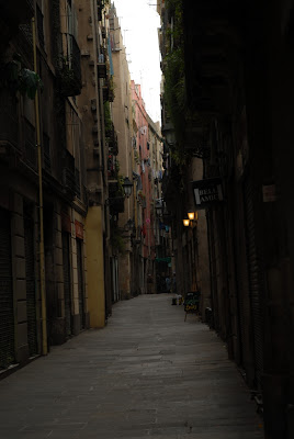
Here's a picture I took of a dark, street in Barcelona. It's a little too dark and narrow if you ask me - you'll have to trust me for now that the shops and restaurants made for a much more colorful scene.
Que the cheesy "diagram" - here's a photo of the same photo, opened in Aperture, but with the histogram in the upper left corner:

Looking at the histogram, it's obvious that most of the pixels in the image are concentrated on the left side of the graph, hence the dark and dreary photo.
Histograms are incredibly helpful, in my opinion - when I keep making the same mistake photographing certain situations, I look at the histogram to determine what parts of the image are overexposed or underexposed, and take those lessons with me when I go out to photograph again. And remember that while the histogram pictured above is sort of an "ideal" it is really up to you, the photographer, to determine what you like and don't like with respect to the tones and brightness of an image.
Next lesson we'll discuss ways to edit my Barcelona street photo, using the histogram as a guide.


0 comments:
Post a Comment