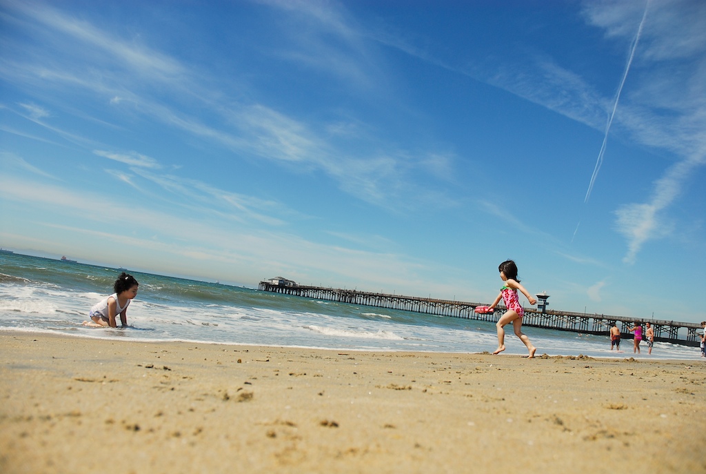
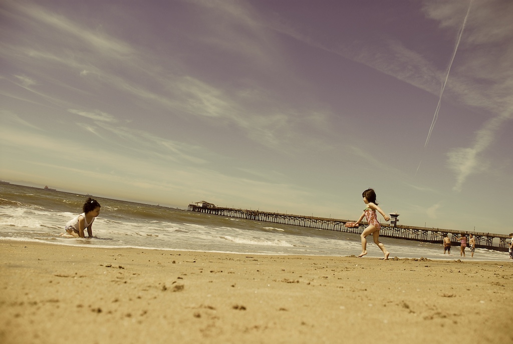
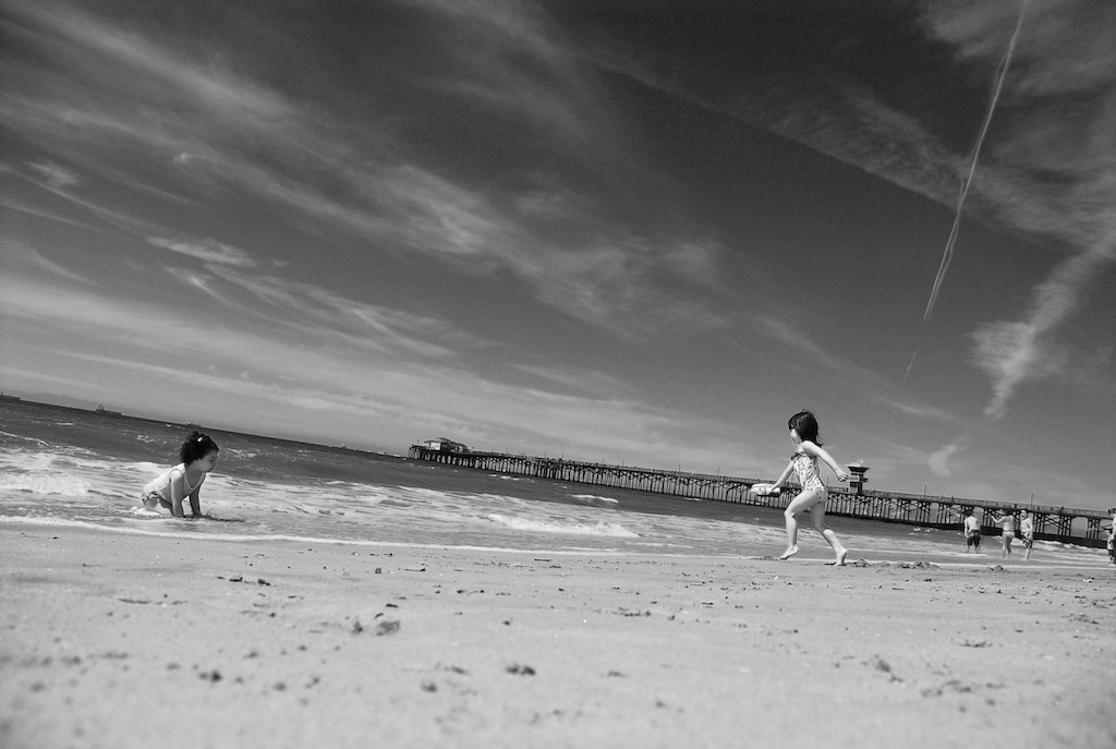
one photo - three ways
I have looked at these now for a couple of days and I still can't decide which one I like the most:
color
vintage
b+w
When it comes to editing photos, I'm finding I'm a bit of a purist - I like when my photographs reflect the scene as it actually was, which is why I'm drawn to the first one in color (with some minor edits in Aperture). However, after talking with other photographers in the blog world, I'm learning more and more techniques in the post-production process to create beautiful photos, even if the edits don't add up to a pure and accurate representation of the scene. The vintage tint is my answer to sepia tones - I love the sort of 60s vibe. And the black and white is so dramatic.
Which do you prefer? Look up my editing 101 series to find posts on how to use editing to create some fantastic (and sometimes not exactly accurate) photos.


3 comments:
you already know what I am going to vote on this. I really do love color pics too, but for this one, I feel like the vintage pic is my favorite. Reminiscent of another time, like you said.
I prefer the first but it's almost a tie with the second.
Black and White used to be my favorite but now I'm finding that I only B&W when the subject is close up (face, hand, inadamant object).
It's a great shot and angle!
p.s.hopped over from cherry tree lane :)
I love the color one the best. The sky is just an amazing color.
Post a Comment