Showing posts with label photography 201. Show all posts

Tuesday, September 15, 2009

photography 201 - bouncing flash

Planet Neil has an informative tutorial on how to bounce flash. Essentially, flash produces a harsh light on your subject because it is a small source of light - by bouncing flash off the ceiling or the wall, you create a much larger light source, and more favorable lighting conditions. (NOTE - this tutorial is for those of you using an external flash unit). The article is great because it challenges photographers to think beyond the 45-degree-angle-flash-bouncing-off-of-ceiling approach. He uses some of his photos and describes the angles and settings he used in order to achieve no discernable flash shadow.

I learned a lot from this article, so I thought I'd pass it along - click here to check it out.

As for future Photo 201 lessons, I can't promise I'll get to them every other week like I'd hoped, but I do promise 1 advanced lesson a month.

Now go forth and bounce that flash!

Tuesday, August 11, 2009

photography 201 - exposure metering

I'm sort of embarrassed to admit I didn't know what the heck exposure metering was until recently. I thought I knew most of my camera's bells and whistles by now, but since I didn't read the owner's manual cover to cover, I guess there are some (ok many) things I missed. But I can't be the only one, right? So without further ado, let's talk exposure metering.

First off, let me clarify that I'm talking about in-camera exposure metering. I am not, however, talking about your various camera modes - this is photo 201, so we're taking it to the next level. Check your owner's manual to locate where your exposure metering control is located - on my Nikon D200 it's located near the viewfinder on the right hand side (the button that says "AE-L" and "AF-L"):

http://www.digitalreview.ca/cams/pics/NikonD200_back.jpg

Exposure metering determines how the image sensor will respond when a photo is taken. By understanding your options for exposure metering, you will get better exposure for your more challenging shots - shots with tricky lighting conditions. Generally speaking, there are 3 types of exposure modes: (1) center-weighted, (2) matrix or multi-segment mode, and (3) spot.

Center-weighted metering is just as it sounds - the metering focuses on the amount of light in the center of the frame, and sets the exposure accordingly. For example, if the center of your image is a white wedding dress, but the surrounding scene is dark foliage, center-weighted metering will exposure your shot based on the brightness of the white wedding dress. Center-weighted metering can be good for portraits, but many articles I read were not too fond of this metering setting. Take that for what's it's worth...

Matrix metering incorporates various calculations of the lighting throughout your image to achieve the proper exposure. Matrix metering is a more detailed approach to exposure than center-weighted metering. Most websites I perused for this post suggested you use matrix metering most of the time.

Spot metering is similar to center-weighted in that it focuses on the center of the image, but spot metering focuses on a very small portion of the overall image (which varies camera to camera). Spot metering is best for high contrast shots, like this one:

(photo courtesy of Planet Neil)

The lighting varies greatly in this image - spot metering will set the image sensor for the proper exposure of the men in the brightest part of the image.

Consider exposure metering an added boost to getting proper exposure in your photos. Any questions/comments - you know where to find me...

Tuesday, July 28, 2009

photography 201: distance and light

Last photo 201 lesson we discussed how light "sees" your subject, and how important it is to consider the lighting angle when composing your photo. This week we'll discuss (courtesy of Strobist) the relationship between lighting and distance. FYI - this is a more advanced lesson, in that it discusses off-camera lighting, such as an external flash or a strobe light of some sort.

Strobist explains this relationship using the Inverse Square Law - thankfully he does not actually provide any equations or proofs in this discussion (because I would have dozed off right then and there). Here is how he explains Inverse Square Law with respect to lighting:

  • "The closer you are to the light source, the more powerful the light. Get real close and it gets really powerful. Get far away, and it gets weaker."
So far, this seems logical right? For example if you use your on-camera flash and you are 2 feet from your subject, the light will be MUCH brighter than if you were 10 feet away, or 20 feet.

On to the next principle:
  • "The closer you get to the light source, the quicker the lighting values change as you move in. When you get farther away, small differences in distance (from the light) become meaningless."
OK, this statement made me reach for my 3rd cup of coffee. Thankfully there are several demos on flickr that help to illustrate these points, such as this one:


Looking at this photo diagram, you can see: (1) the photo on the left (light source 1 foot from The Bride, or Uma Thurman) produces a more intense light on the subject than the photo on the right (light source 5 feet from Uma). NOTE - both the camera and Uma NEVER move in this exercise - only the light source is changing. As the light source moves further from Uma, the flash output becomes stronger. Also in each photo the light source is moved further back from Uma.

You can see from this photo diagram that by moving in close to the subject (photo on the left), the wall behind Uma Thurman is almost black. The flash illuminates Uma, and very little of what's behind her. As the light source moves further back, though, the difference in the shade of the gray wall is minimal, and the photo is more evenly lit throughout.

So let's review the above statement:

"The closer you get to the light source, the quicker the lighting values change as you move in. When you get farther away, small differences in distance (from the light) become meaningless."

To paraphrase, the closer the light is to the subject, the more dramatic the lighting, however, as the light is placed further and further from the subject, the differences become less and less dramatic.

Strobist describes this concept as "lighting depth of field":
  • Light Placed Closer = more powerful, and control of the depth of the correct exposure.
  • Light Placed Further = less powerful, and a broader zone of even lighting exposure.
In other words, light placed closer to your subject is like working with shallow depth of field. Light placed further from your subject is less powerful, but provides a more evenly-lit photograph.

This is not an easy concept to grasp, but it's a pretty powerful concept once you understand it. Click here for the full lesson at Strobist - there are homework assignments to help you understand the lessons more fully. I'd like to do the "homework" for this lesson - I'll post the results as soon as I complete the homework (no promises on when that might be...)

Tuesday, July 7, 2009

photography 201 - 2 ways to improve lighting

Right now, the Photo 201 series of lessons is dedicated solely to my need to devour any and all information on lighting before I play wedding photographer (which is less than two weeks away...) Last lesson we discussed how light "sees" your subject, and how angles and light affect your photo's composition. Lately I can't go anywhere without really analyzing the light and how it creates shadows on various objects. This week's lesson is sort of a prelude to the next series of lessons over at Strobist. Some of you out there may be very comfortable shooting in natural light, but you wish you knew how to improve the lighting in certain situations. Here are two ways (the two I've been focusing on in preparation for the wedding...)

Light Reflector

You may have seen these at the camera store before - they look like the shades you put in your car window to protect the interior from sun. Now that you have an adequate visual...a light reflector can be used to capture available light and redirect it toward your subject. Reflectors help to minimize shadows and even out the lighting on your subject. There have been several instance where I wished I could eliminate the shadows on someone's face without resorting to flash - this is where a reflector comes in handy.

Here's a quick tutorial on light reflectors that I found over at youtube:


Anyone can use a light reflector to improve lighting - point and shoot or SLR camera owners alike - but for those of you DSL owners itching for some more camera equipment, read on.


External Flash Unit

http://images.izideal.com/img/product/216-d1aa94540ffa1c768237f76e8da95472/l/es/nikon-flash-sd-800-dx.jpeg

The bad boy pictured above is one example of an external flash unit. It is a flash unit you purchase separate from your camera body (as opposed to the flash that is built into the camera body). The external flash unit offers much greater lighting flexibility - you can determine how bright the flash output should be and from what direction the flash should be coming from (when using your flash off-camera - another lesson for another day). You can even get fancy with it and create light sources from directions other than from the top of your camera - you can bounce the flash off a wall, off the ceiling, or you can attach the flash to a tripod and move the flash to the left or right of your camera.

Check in 2 weeks from now for another Strobist inspired lesson on lighting, using my external flash...


Tuesday, June 9, 2009

photography 201 - understanding histograms part 2: adjusting levels

Last photo 201 lesson we discussed histograms - this lesson we'll discuss how to make levels adjustments to improve the overall brightness and tones of your photo.

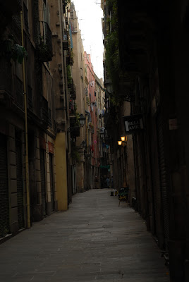
Here is my photo from Barcelona:

and here's the photo with the histogram pictured alongside of it:


As we discussed last "class" the histogram shows the luminance of the photo, and specifically that most of the pixels are concentrated on the left side, meaning the photo is pretty dark. By adjusting the tonal levels in this photo, however, we can significantly improve the overall look of the photos.

(PS so sorry for this not-as-easy-to-see-as-I-thought-it-would-be photo of the levels adjustments. If you look closely at the left side you will see "Levels" and the histogram. There is a place on the left, center, and right where you can move the levels to make adjustments. You can click on the photo to enlarge and see it more clearly, although the photo is still crappy. But I digress...)

In Aperture, the levels editing tool allows you to edit luminance (light, mid, and dark tones) and RGB (red, green, and blue tones). The photo above shows the levels adjustment set to luminance - in my opinion this photo just needs to be brightened up a bit.

A quick note - levels adjustments are more precise than if you simply adjust the photo for overall brightness. Specifically, you can adjust the darker tones, mid tones, and light tones rather than just brightening or darkening the entire image.


In this photo, I adjusted the light tones only (starting from the right, moving the level towards the center), but notice that by moving the light level towards the center, the mid-tones level (in the center) also moved as well. The photo is brighter than the top image, but I think I can do more:


In this photo I further adjusted the mid-tones to make the image even brighter (which is really hard to see in the photo of Aperture, but look closely at the white lines in the level adjustment...) These changes are definitely subtle, but look at the yellow on the storefront and the foliage near the top - here you can see a noticeable difference in the brightness of the photo. The image is still on the darker side (it is a small windy road in Barcelona, mind you) but more visually interesting after making the levels adjustments.

And if that's not enough for you, you can also make adjustments to the highlights and shadows of the image. By adjusting the shadows, you are lightening the darker areas of the photos. Adjusting the highlights will darken the lighter areas of the photo. I know this is a little counterintuitive, but it makes sense after you practice with the adjustments.

Here's the final photo with some additional shadows adjustments:


By lightening the shadows, you can see more of the detail of the storefronts, the doorways, etc.

Here's a side by side comparison of all 4 photos (moving left to right) - notice the changes are subtle from photo to photo, but the difference between the unedited photo (far left) and the fully edited one (far right) is pretty dramatic.


I think the best way to learn about levels adjustment is to experiment with your own photos. In fact, when it came time to write this lesson, I had a hard time putting it to words, because I think the easiest way to figure out level adjustments it to just feel it out on your own.

Please post questions or email me.

Tuesday, May 26, 2009

photography 201 - understanding histograms (part 1)

I decided that photography 201 will meet every other week on Tuesdays, so for those of you looking for a little more advanced lessons here at Lens Flare, check in every other Tuesday.

Today's topic is histograms. I will apologize right now for how amateur some of these photos/diagrams will be. I am not a tech wizard by any stretch of the imagination. Here is a diagram of a camera histogram, courtesy of luminous landscape:

A camera histogram is a graph that illustrates the brightness of tones and/or colors throughout your photo. Histograms can read luminance (brightness) or RGB (red, green & blue tones). Reading from left to right, the graph charts the darkest tones, moving towards the mid tones to the lightest tones. The higher the graph at any given point, the more pixels of that tone are present in your photo. Ideally, a properly exposed photograph should have a graph looking like the one above - a nice concentration of tones/colors in the middle and essentially nothing on either edge.

Most cameras have a histogram reading that you can access on your camera's LCD screen. You can also review histograms when editing your photos (which is what I do).


Here's a picture I took of a dark, street in Barcelona. It's a little too dark and narrow if you ask me - you'll have to trust me for now that the shops and restaurants made for a much more colorful scene.

Que the cheesy "diagram" - here's a photo of the same photo, opened in Aperture, but with the histogram in the upper left corner:


Looking at the histogram, it's obvious that most of the pixels in the image are concentrated on the left side of the graph, hence the dark and dreary photo.

Histograms are incredibly helpful, in my opinion - when I keep making the same mistake photographing certain situations, I look at the histogram to determine what parts of the image are overexposed or underexposed, and take those lessons with me when I go out to photograph again. And remember that while the histogram pictured above is sort of an "ideal" it is really up to you, the photographer, to determine what you like and don't like with respect to the tones and brightness of an image.

Next lesson we'll discuss ways to edit my Barcelona street photo, using the histogram as a guide.

Tuesday, May 12, 2009

photography 201 - editing color

I'm introducing a more advanced lesson for Lens Flare readers - Photography 201. I haven't decided how often the Photography 201 feature will appear, but I figured it was time to kick it up a notch - at least for myself. Writing posts on the basics of photography has helped me a tremendous amount in my photography skills, and I'm hoping the Photography 201 series will really develop skills and techniques I've been intimidated by and/or afraid to tackle.

I need to admit something up front - I have no background in Photoshop. Zip. ZERO. My husband purchased Aperture (Apple's answer to Photoshop) for me as a birthday gift about a year ago, and while it appears to be amazing (much like Photoshop seems to be), I have only scratched the surface of what Aperture is capable of. So when I read the post on
color balance over at Pioneer Woman Photography, I was inspired to take color editing to a new level. Any of you looking for Photoshop tips should check out this blog, and there are also some great posts on photography basics. This particular post focuses on editing in Photoshop, but it is definitely applicable to editing in Aperture or any other more advanced photo editing software.

Pioneer Woman Photography explains that for digital photographs, any weird color casts you might have (such as the spooky green light in her photo at the barn) are the result of white balance - or more specifically, an incorrect white balance setting. You can fix white balance after the fact by adjusting the color temperture or saturation of a particular photo, but this post takes it a step further by explaining how you can adjust specific colors in a photo.

I even did a little homework for you to show an example - here is my straight out of the camera (SOOC) image of my daughter in her crib:

Since most of you have not seen her room in person, you'll have to take my word for it that the photo is too yellow - look closely at the crib rails and you will see a yellow cast to them (her crib is white). The yellow color cast is subtle, but it is definitely incorrect.

So I took Pioneer Woman's advice and adjusted the color in Aperture, which allows color adjustments for red, yellow, green, cyan (aqua), blue and purple tones. Since I thought the photo was too yellow and maybe even too red, I adjusted the red and yellow levers, with this result:


I think the changes are subtle but clearly an improvement - her skin tone and the whites in the photo are much more true to life, and the overall image is softer. Now I won't be so quick to delete photos that have funky color casts!

Thanks Pioneer Woman!


Thursday, March 19, 2009

photography 201 - working with shallow depth of field


I recently purchased a 50mm/f1.4 lens for my camera. I love the lens for portraits, especially since with the maximum aperture you can really blur any distractions in the background and achieve some fabulous light and colors in your photos.

But take a close look at this picture - this was taken with an f-stop of 2.5, and I'm about 4 feet away from my 3 year old. I was attempting to focus on her face, but only the sleeve of her sweatshirt is actually in focus (and maybe some of her hair). I seem to be having this problem now that I have a lens with an f-stop greater than 3.5, so I decided to do some research and see what the problem might be (assuming I know how to focus my camera, which I do. Most of the time).

The answer? Shallow depth of field. Shallow depth of field is where a very small portion of your image is actually sharp while the rest is blurred. If you are shooting a landscape photo, for example, you would want the widest depth of field you can achieve so that the entire image is sharp. But for portraits (which I take more frequently) I love images where the face, especially the eyes, are sharp but the rest of the image is blurred. FYI the quality of the blurry portion of the image is referred to as the "bokeh" in a photograph, and while there seems to be various debates on the quality of one's bokeh, we'll stay out of the debate for now.

A friend of mine asked me why when she would take a picture of 2 or 3 kids using her 50mm/f1.4 lens, one of the faces would be sharp while the others would be blurry or out of focus. The answer is too shallow depth of field, which allowed for only a razor-thin portion of the photograph to be in focus while the rest becomes more progressively blurry (see my picture above).

So how to fix this? You need to make adjustments to the following: (1) aperture setting, (2) focal length OR distance between you and your subject, and (3) ISO setting.

If you are using the automatic setting on your SLR, change to aperture priority setting (or manual setting) and increase your f-stop number (thereby decreasing the amount of light entering your lens/camera). For example, the aperture setting for my photo was f2.5 - pretty large. If I had used f3.5 or f4.2 I would have more of the image in focus, rather than just my daughter's sleeve.

Here are some images of various f-stop settings:

apertureapertureaperture

Another option, since I was using a fixed focal length lens, would have been for me to back up a little (although since she was climbing up something and I was by myself with her, I didn't want her to fall...). If you are using a variable length lens, try decreasing the focal length to see if your image is sharper. As a general rule, the longer the focal length the shallower the depth of field. For example, a 200mm focal length will produce a more shallow depth of field than a 50mm.

Also, the lower the ISO setting the greater depth of field you can achieve. So if you are shooting at 800 ISO, try lowering to 400 or 200 and see if your images become sharper.

Any questions? Leave me a comment.